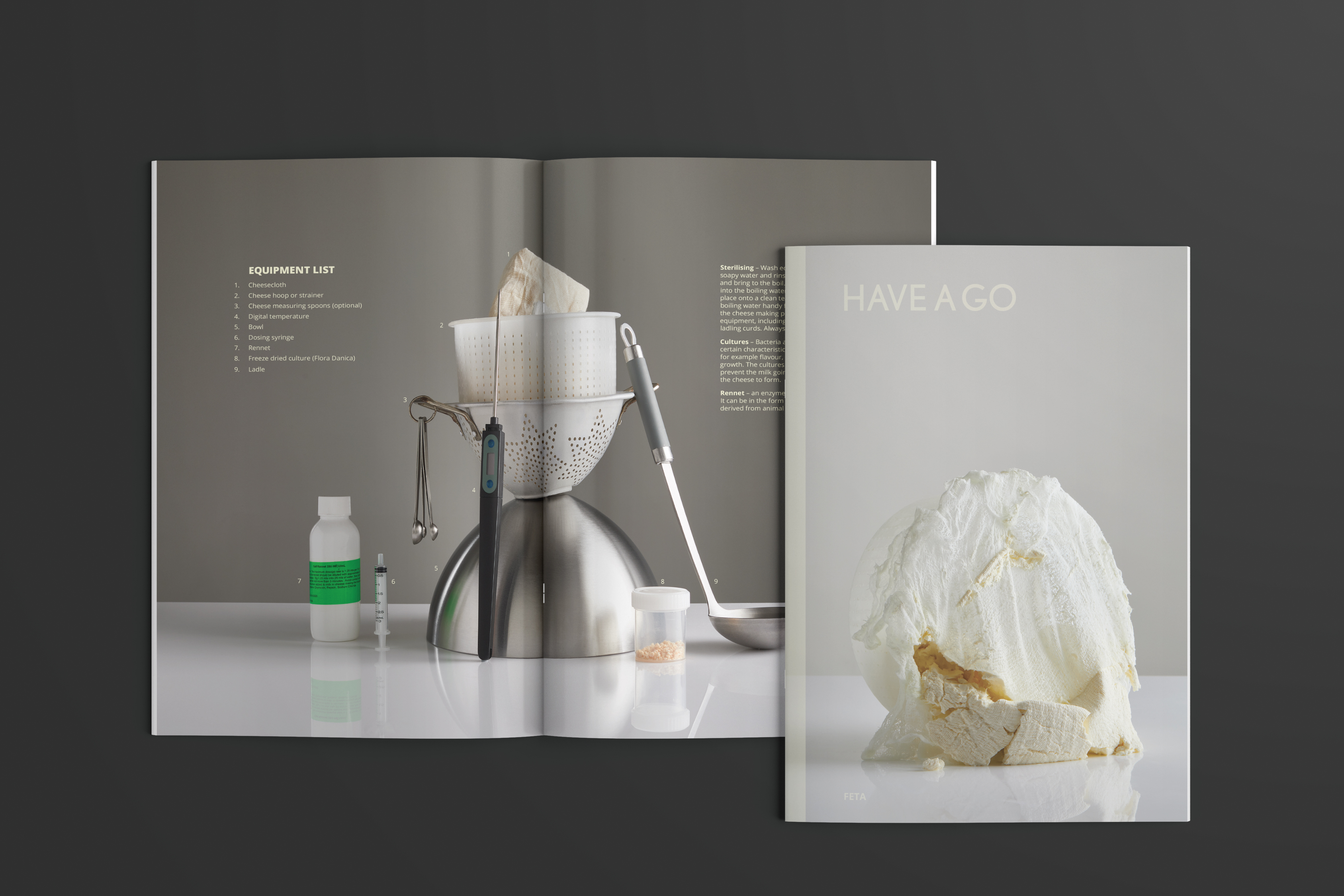
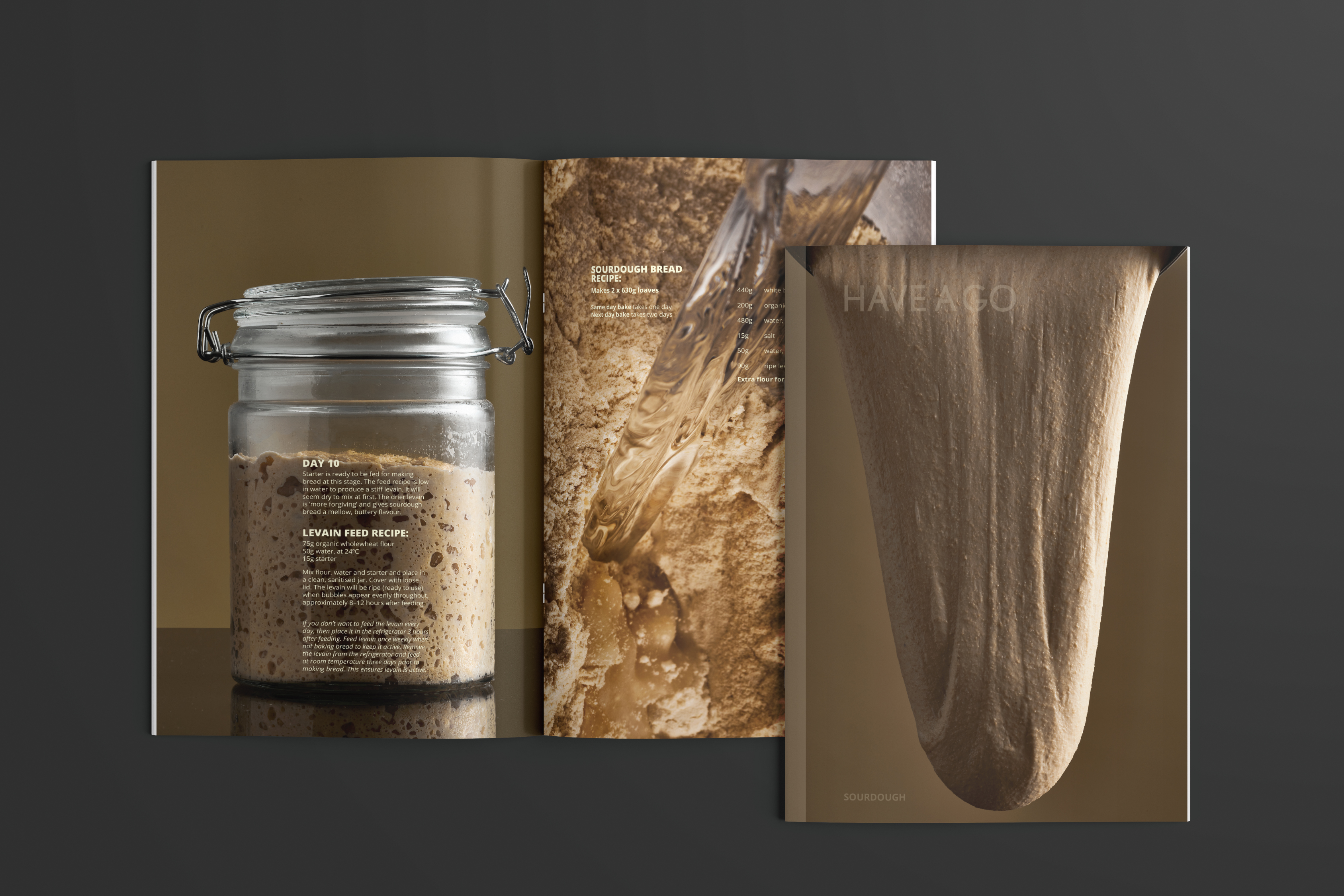
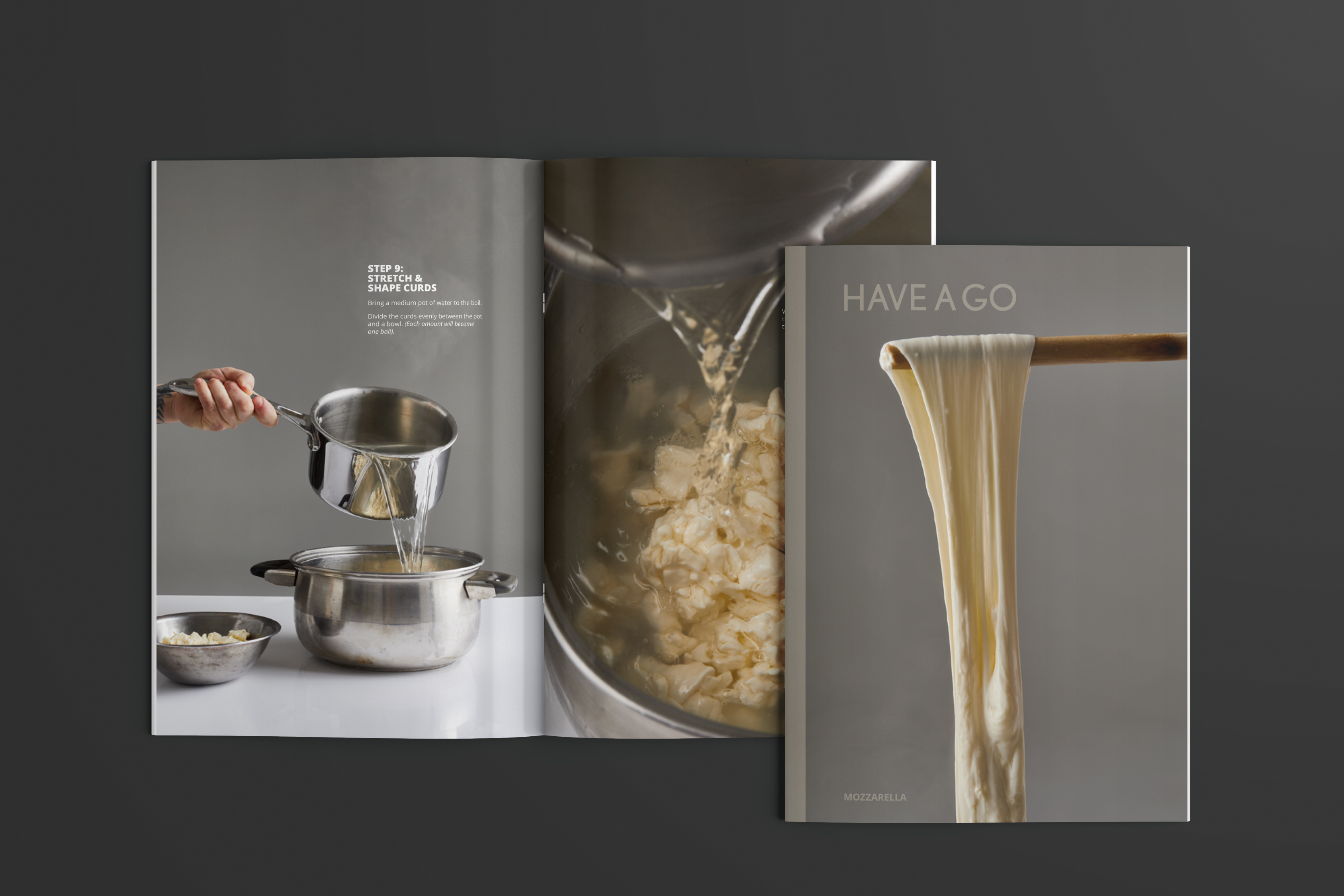
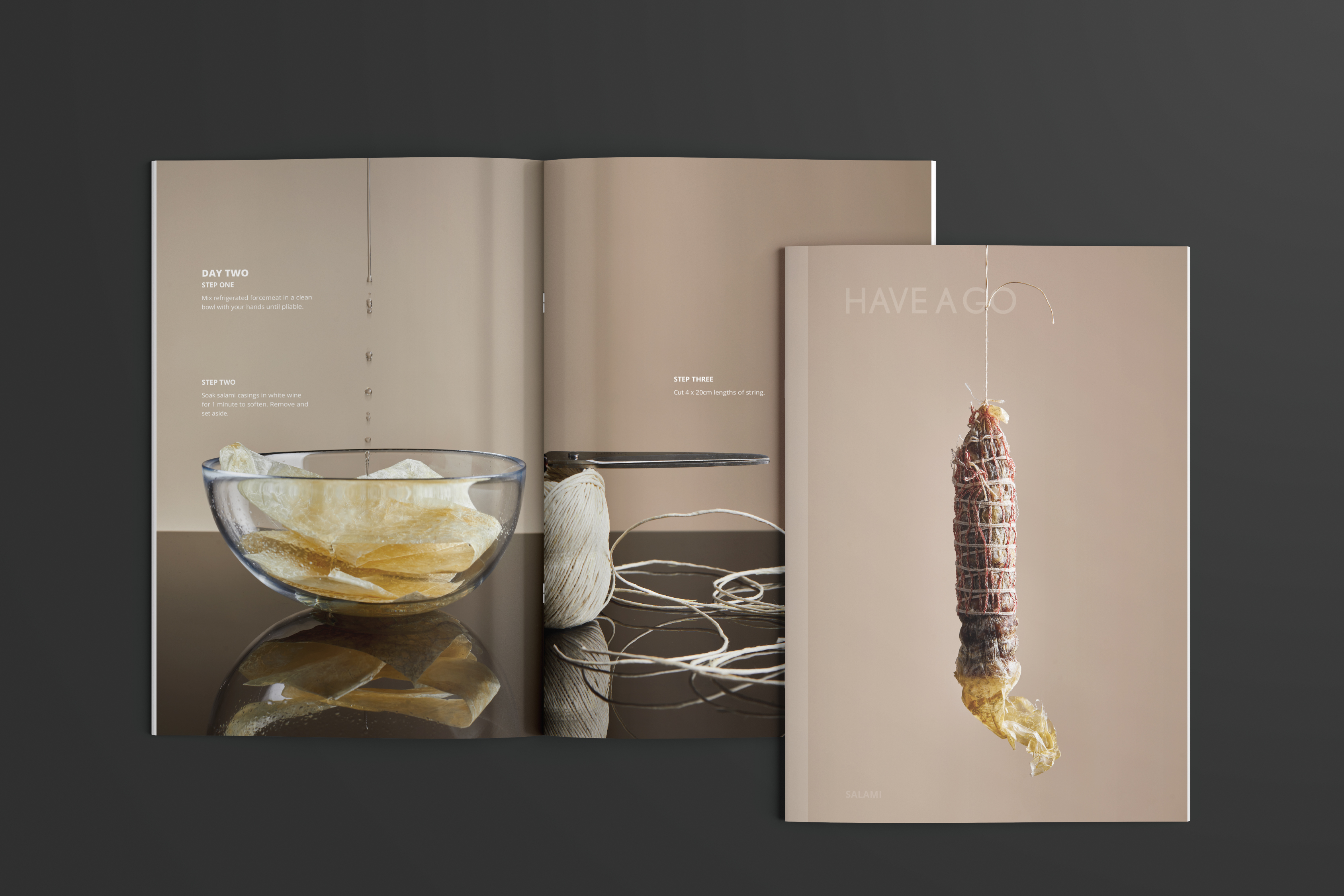
Have A Go Series
Two creatives approached me with an ambitious brief: create an identity for a photography-focused magazine with step-by-step instructions on how to learn a new skill. My task was to position Have A Go as an exciting new way to learn a new skill.
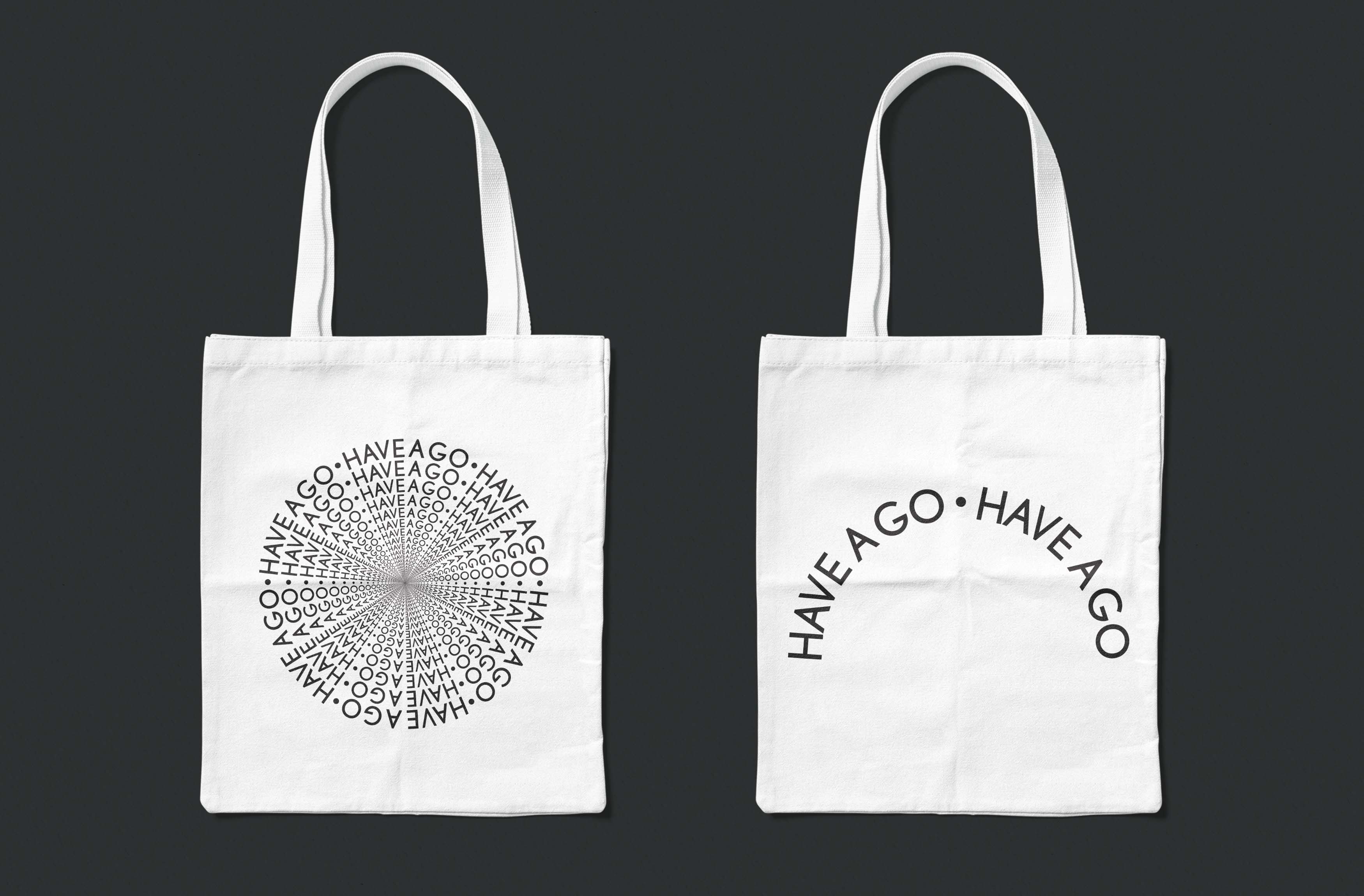
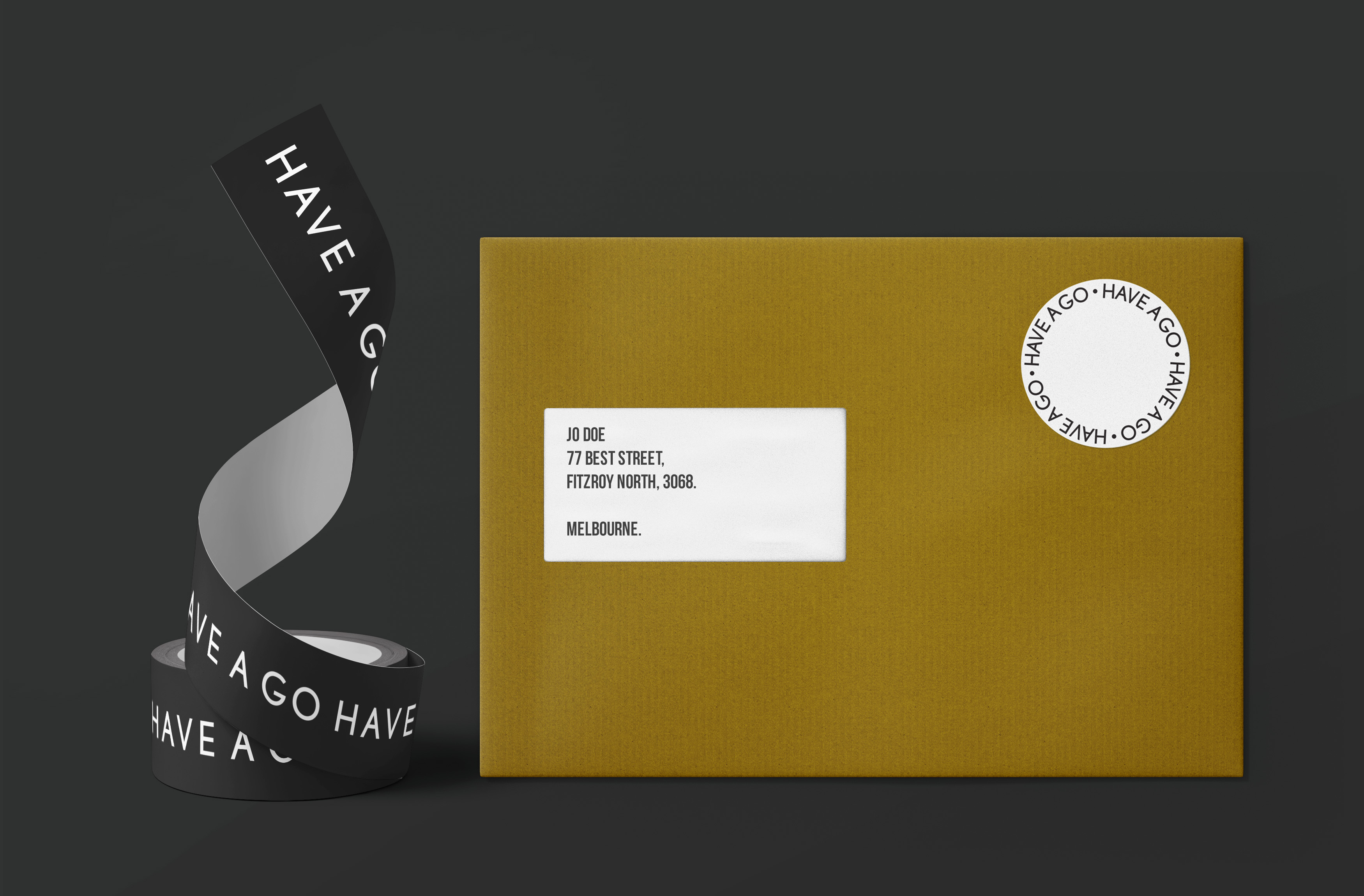
After conducting preliminary research, we discovered that most magazines in the space had to strike a compromise between advertisements and design, so we decided to remove all advertisements. This provided us complete layout freedom and allowed us to take a minimalist approach to branding and typesetting.
Have A Go Series published quarterly, is a collectable magazine that is all about “having a go”. With beautiful photography and effortless instructions, the reader’s journey at the conclusion of each issue is a newly gained skill.
To date, the catalogue of issues includes Feta / Fromage Blanc, Sourdough, Croissant, Mozzarella & Salami.
We created a clean brand identity with the focal logo involving repetition that symbolises the nature of each issue and the continuation of learning. Also in charge of creative and print collateral layout design we designed an elegant layout that let Jana Langhorst photography shine.
Printed in Melbourne and distributed worldwide, Have A Go Series encourages education and fresh thinking by learning a new skill.
Credits:
Editor - Jo Barrett
Photography - Jana Langhorst
Brand Identity, Packaging Design,Print & Art Direction.


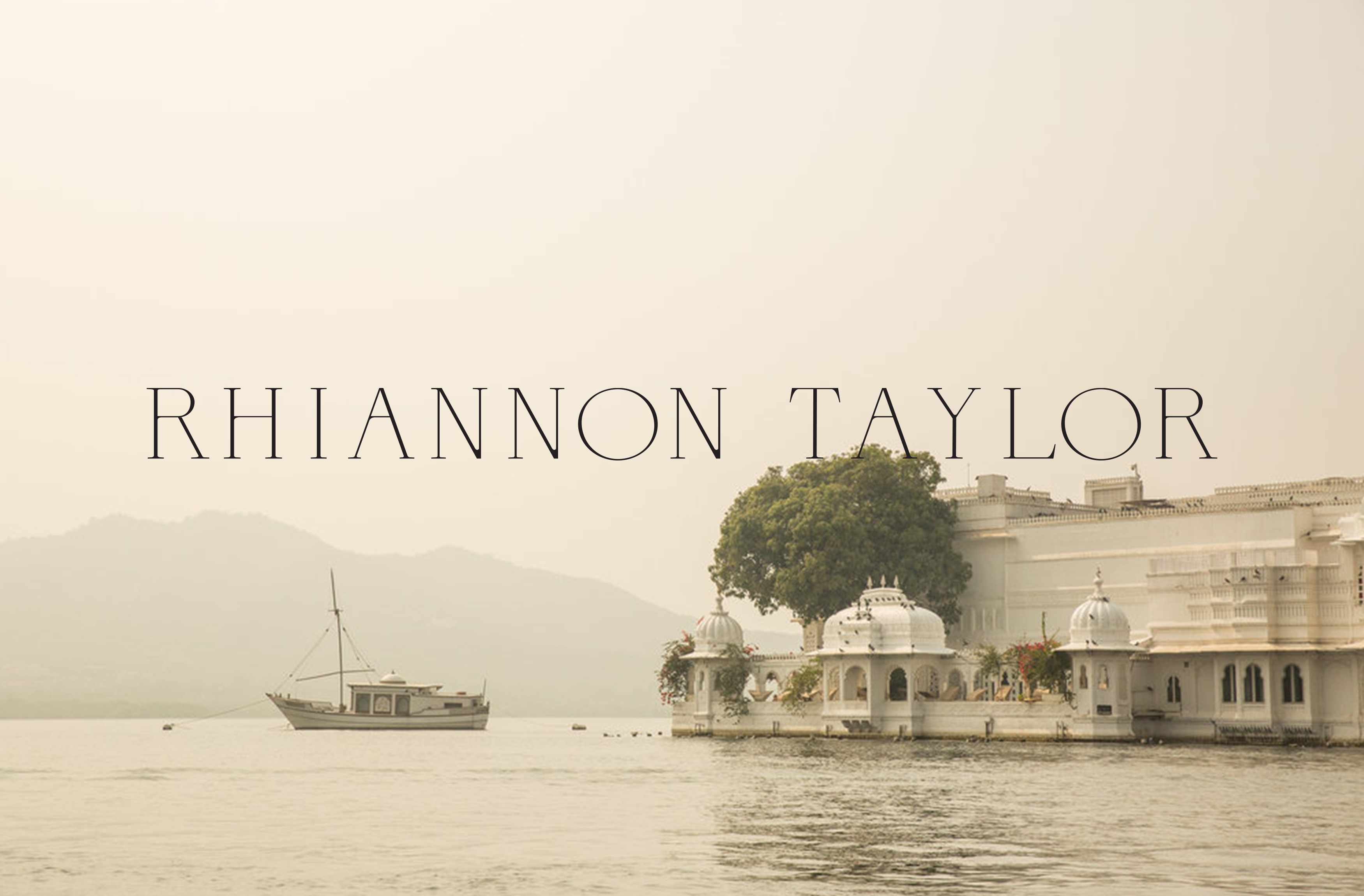
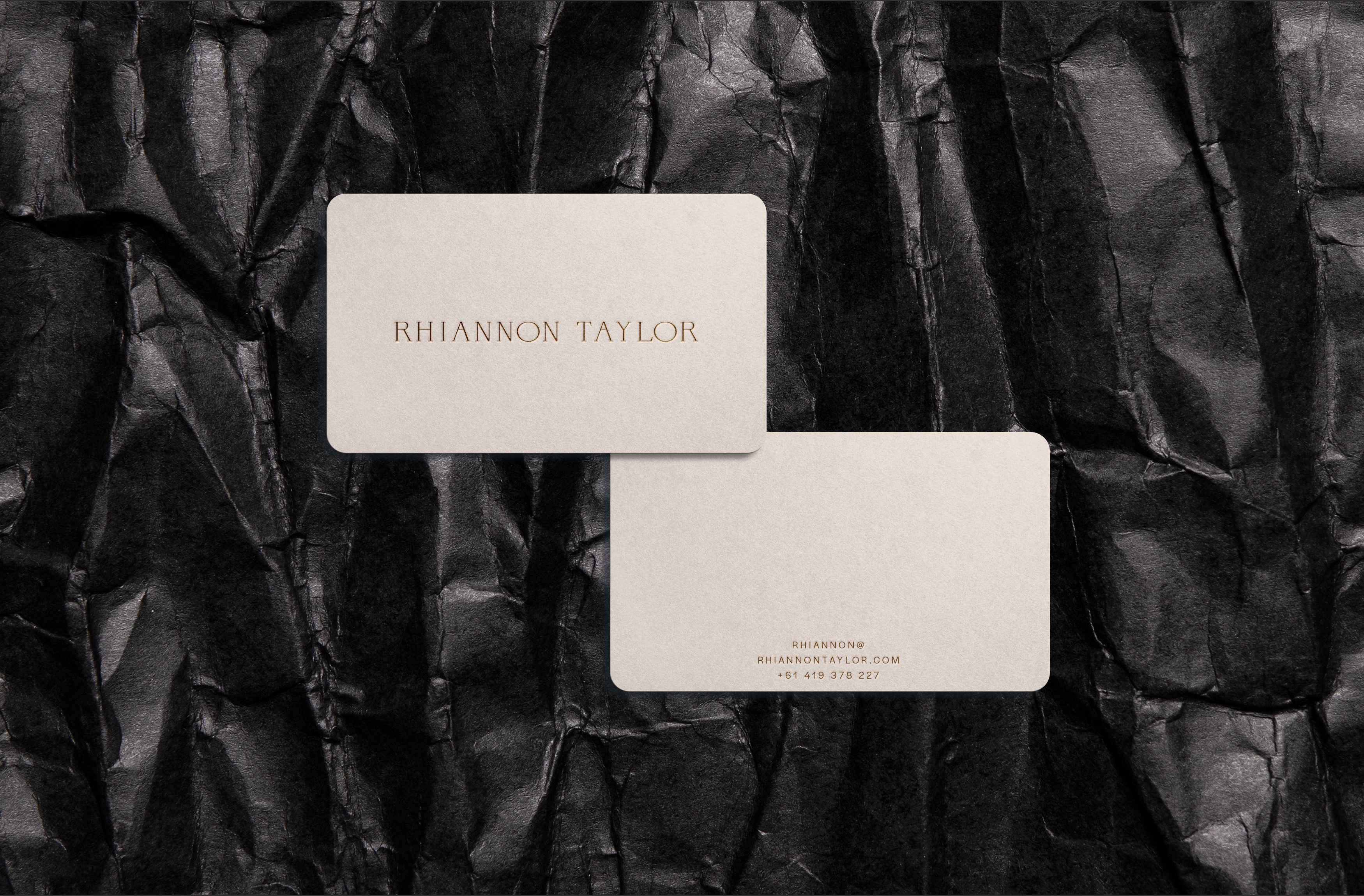
Rhiannon Taylor
Rhiannon Taylor is a travel and lifestyle photographer and one of Australia’s most sought-after. Having worked with the likes of Conde Nast Traveler, Gourmet Traveller, Vogue Living and TIME Magazine.
Rhiannon wanted to refresh her branding identity, so we researched and tested a variety of type treatments to incorporate her elegant photography and came across Neuota. We tweaked the type to add a personal touch, resulting in an elegant identity &
stationery package that
highlighted Rhiannon's photography.
Credits:
Photography - Rhiannon Taylor
Brand Identity Design,Print & Art Direction.

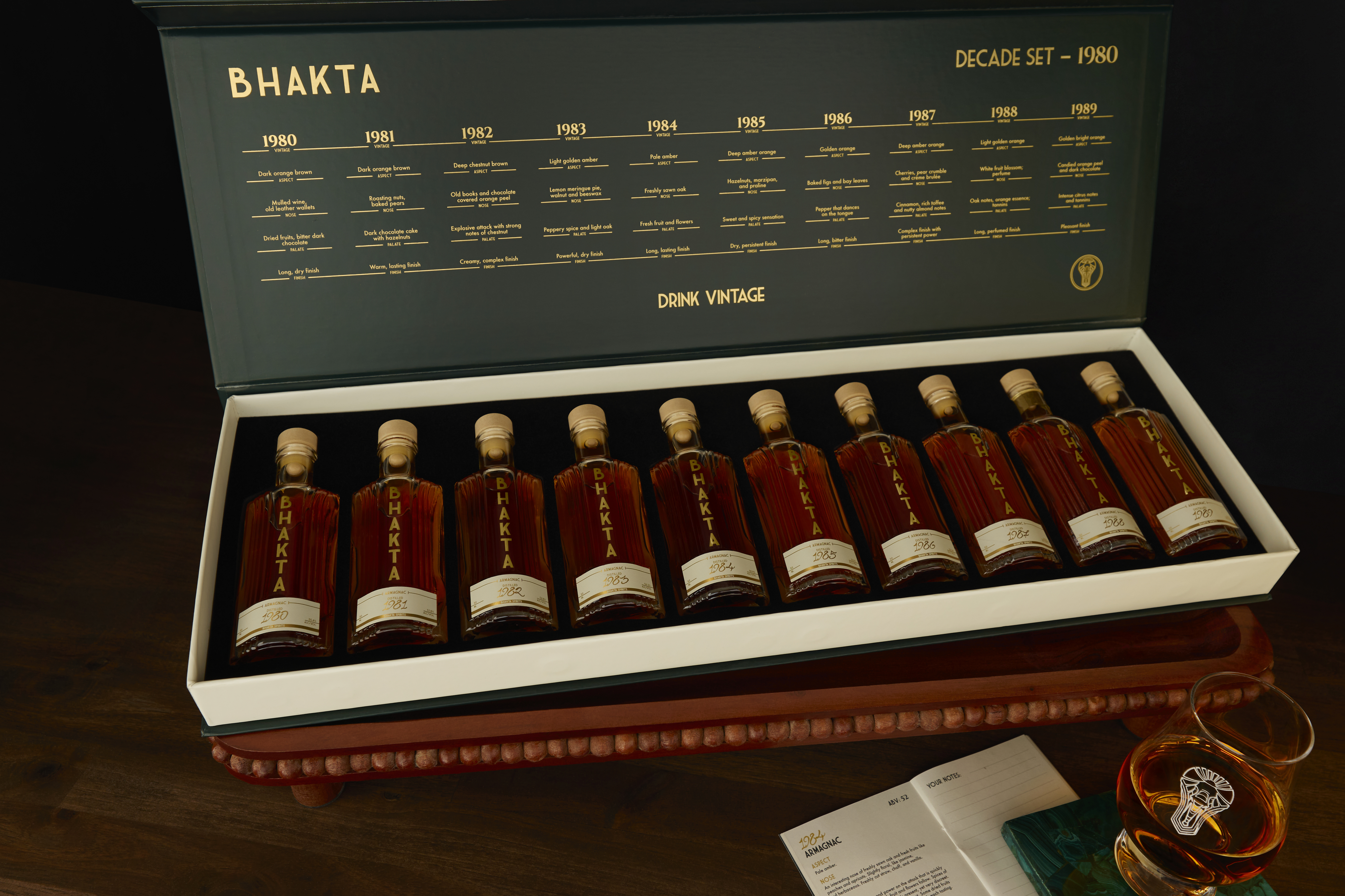
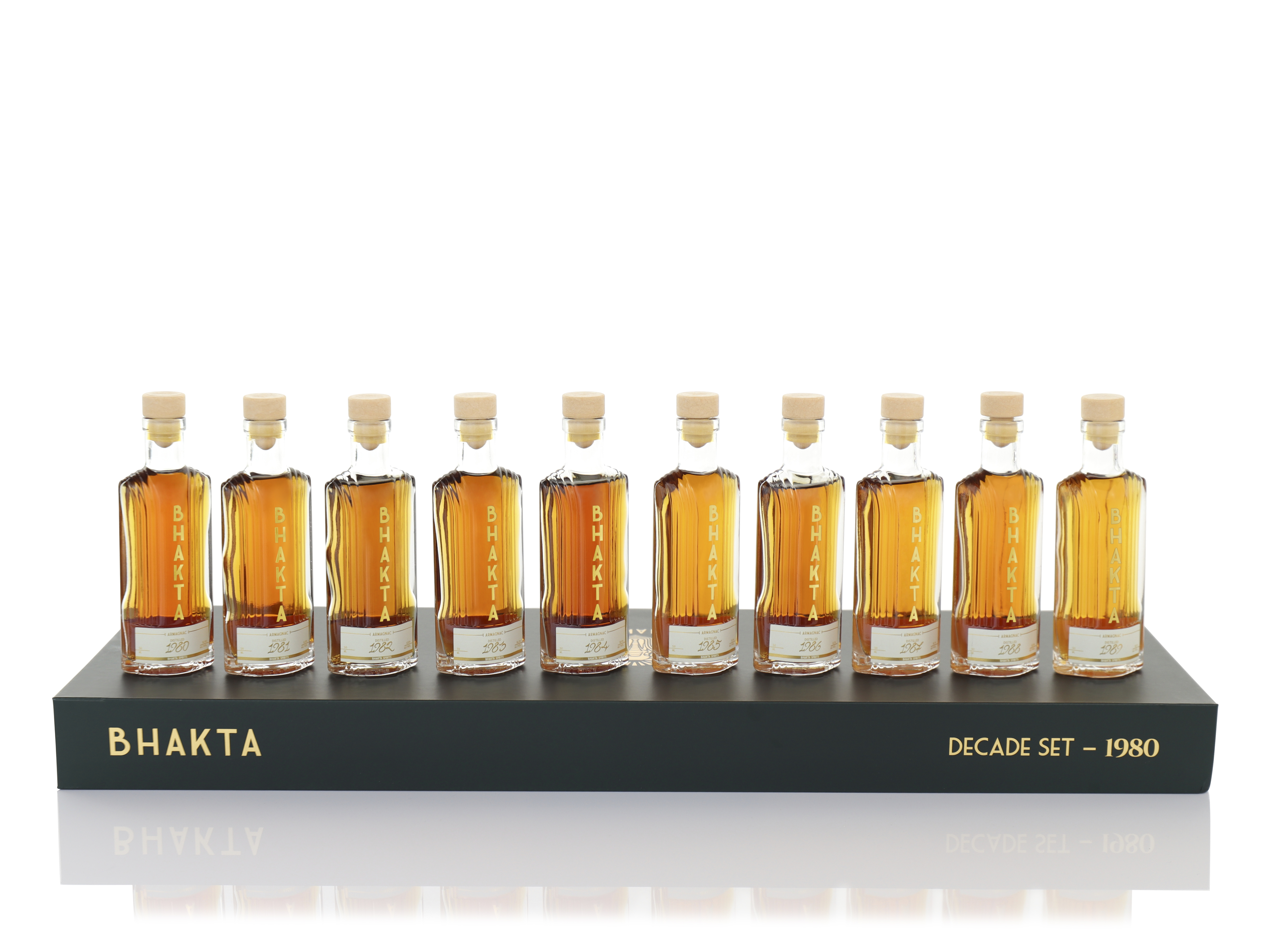
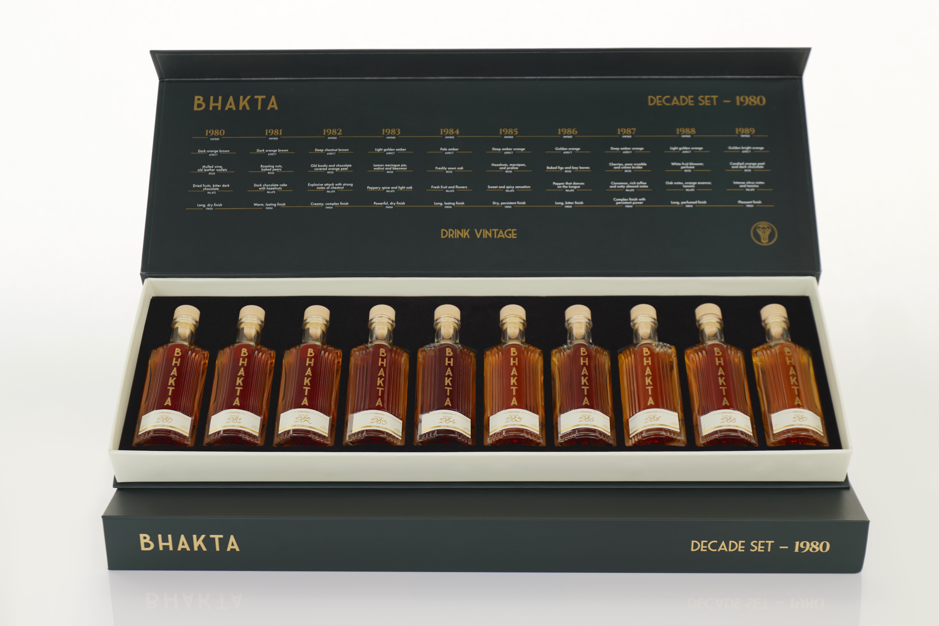
BHAKTA Spirits
1980s Armagnac Decade Set Tasting Kit
A rare taste of history.Bhakta Spirits’ 1980s Armagnac Decade Set Tasting Kit celebrates the sophistication of vintage Armagnac. This premium product includes a beautifully designed tasting journal, along with luxury packaging and branding, to provide customers with an immersive experience.
Design Approach
Inspired by the heritage of Armagnac and Bhakta’s ethos of elegance, I created a cohesive design system that combines rich textures, a bold colour palette, and timeless typography. The tasting journal was designed to engage the user, with thoughtful layouts and space for personal tasting notes.
Deliverables
- Packaging design for the decade set box.
- Bottle labels with a vintage-inspired aesthetic.
- Internal box layout for the tasting kit presentation.
- Tasting journal design, including note-taking sections and vintage-inspired content.
The Result
The packaging and journal were highly praised for their sophistication and attention to detail. Customers appreciated the immersive and cohesive experience, aligning with Bhakta Spirits’ vision for luxury and exclusivity.
Packaging Design, Print Design, & Art Direction.

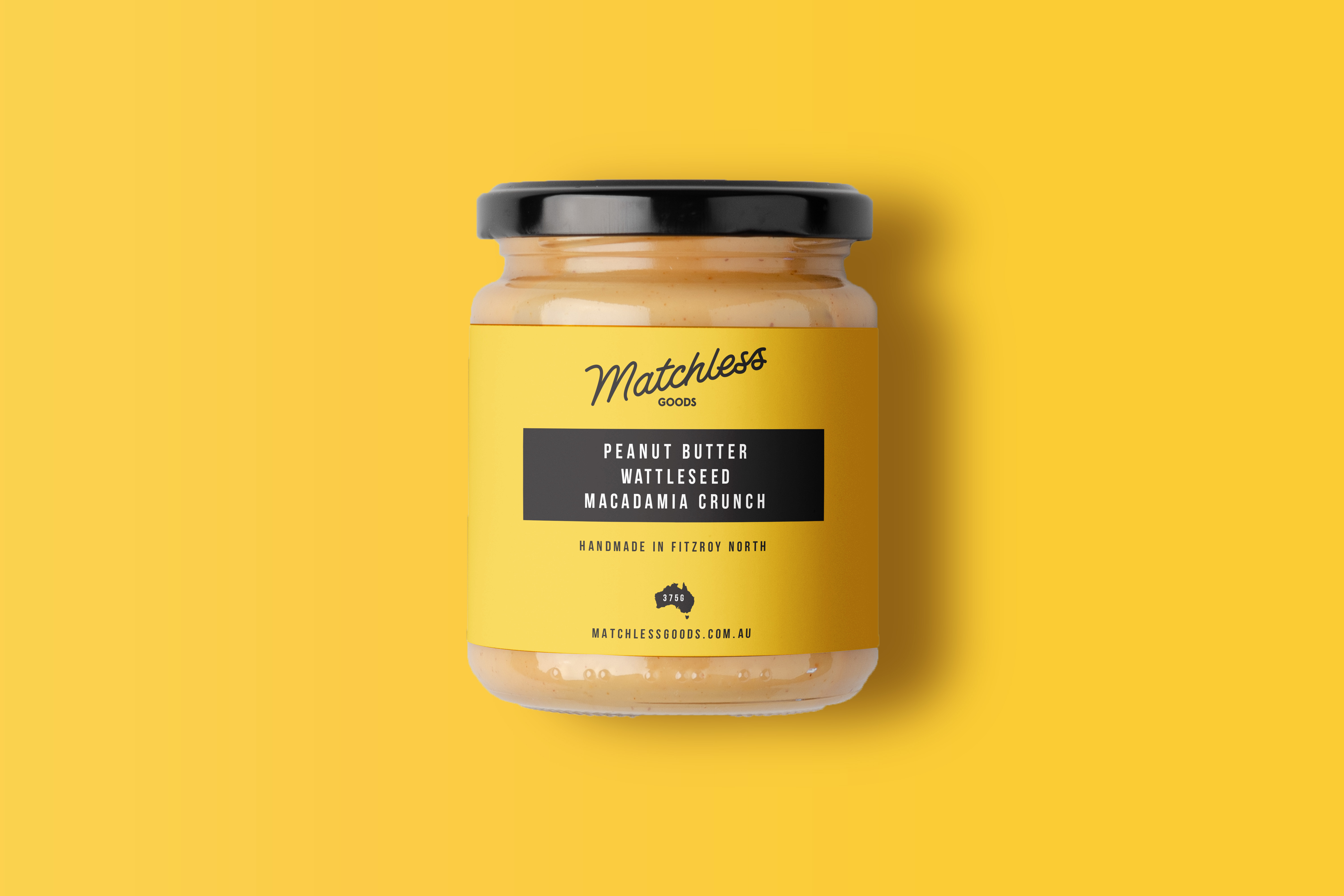
Matchless Goods
Matchless means "unmatched; incomparable," which is exactly how they describe their peanut butter. Matchless Goods was a Melbourne-based small batch peanut butter maker that focused on making peanut butter in a unique way by using only Australian and Native ingredients.
Matchless Goods' branding is clean and simple, while also paying homage to traditional branding from the 1950s. To that end, we created a custom typeface for MG. The signature yellow was chosen to elicit joy and to represent the Sun, as the peanuts are grown in sunny Kingaroy.
Brand Identity Design, Print, Art Direction
& Packaging.
& Packaging.


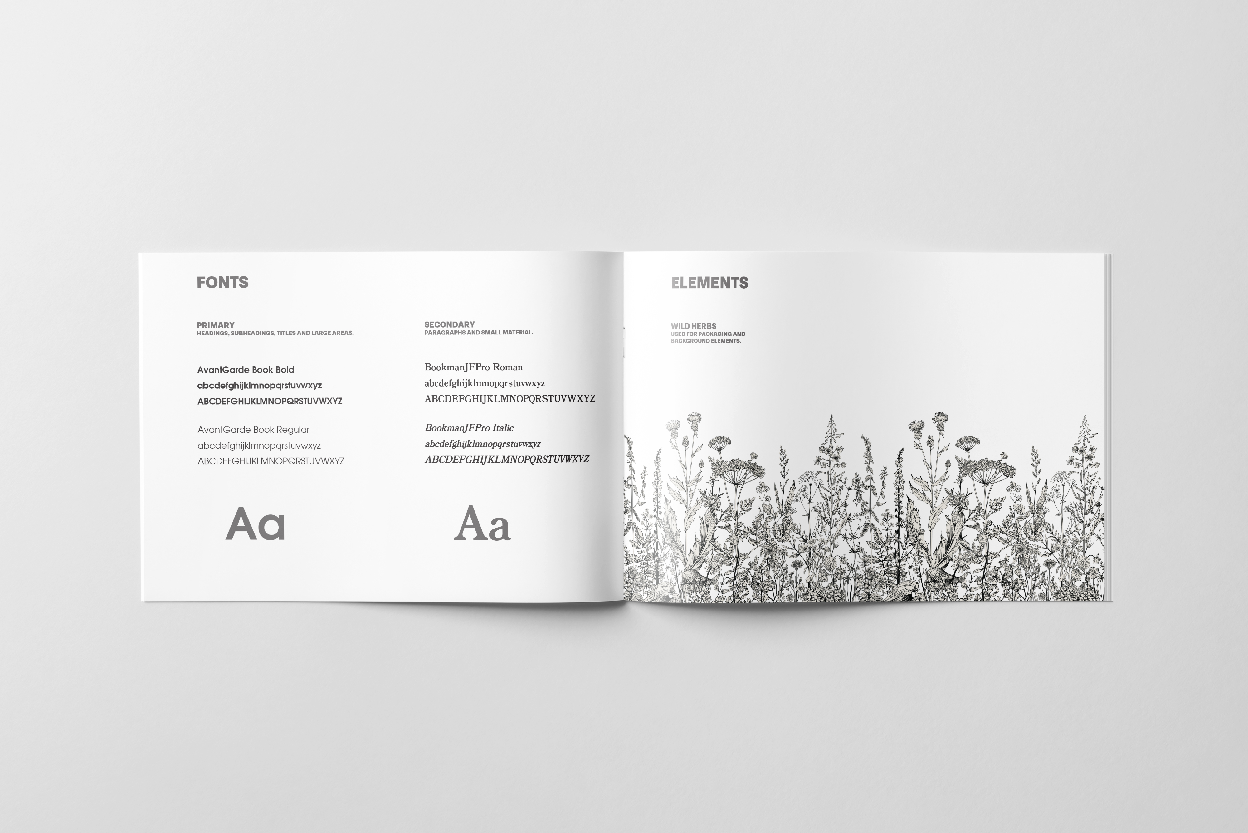
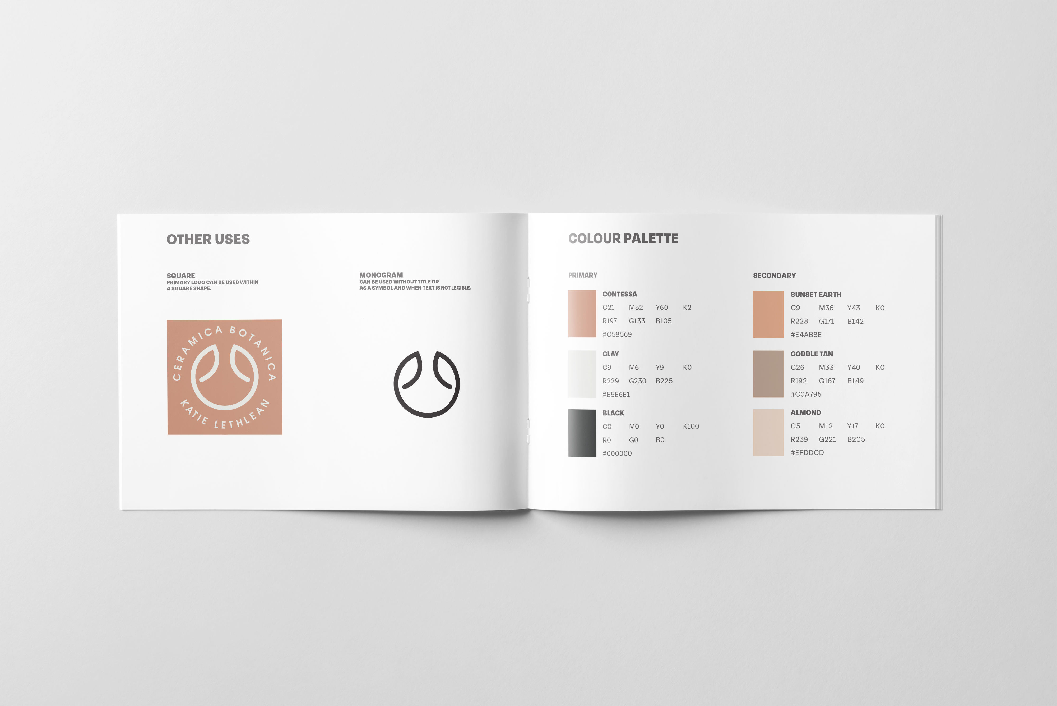
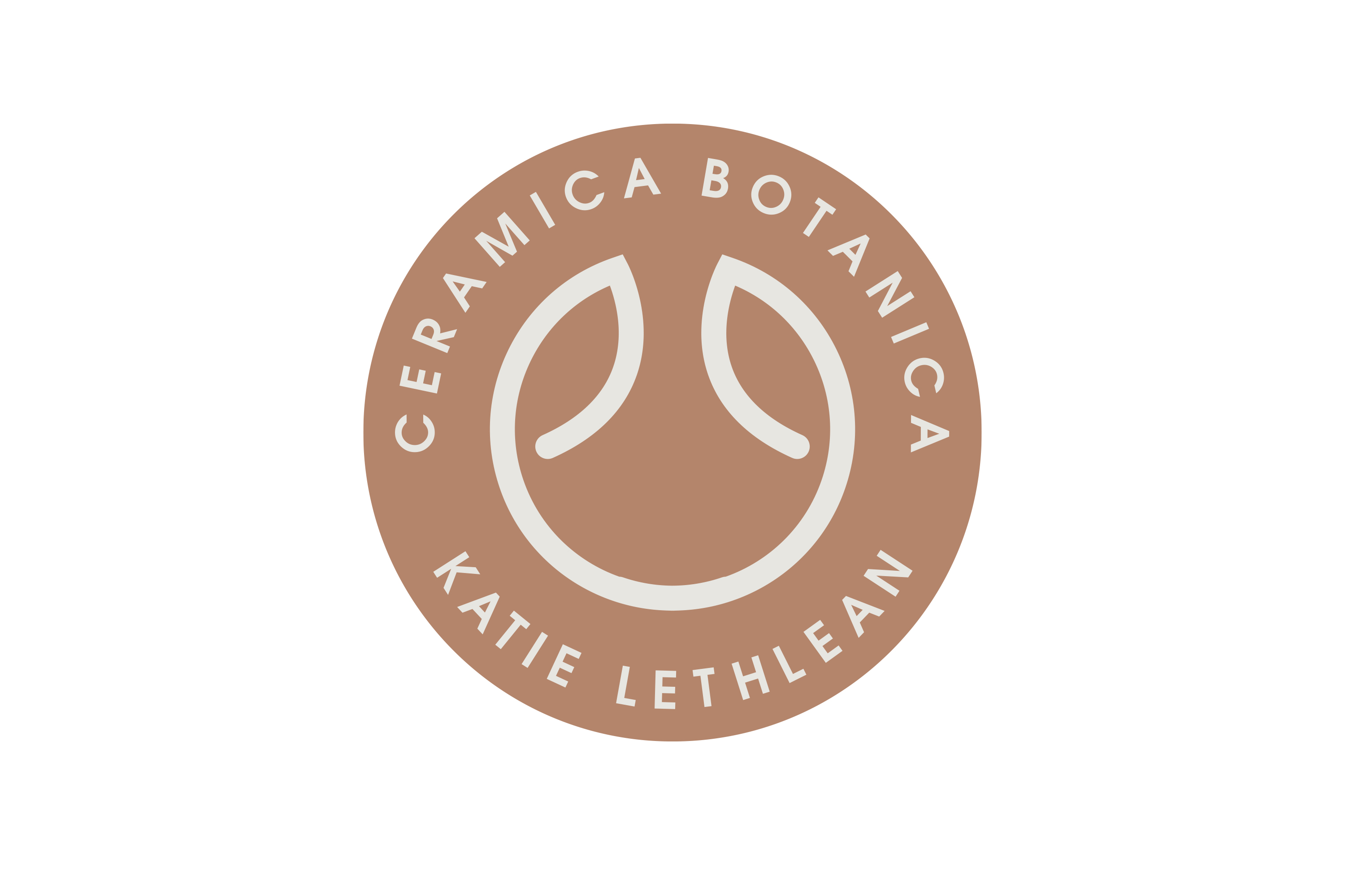
Ceramica Botanica
Ceramica Botanica is the ceramics work of Katie Lethlean, we designed the logo and brand identity. Based on works around the vegetable garden we designed a simple minimalist logo that could be used for a potters mark for her ceramic work.
Brand Identity, Logo Design.